Formulytic Rebranding
-
ClientFormulytic
-
RoleArt Direction, UI/UX Design, Web Design, Web Development
-
Overview
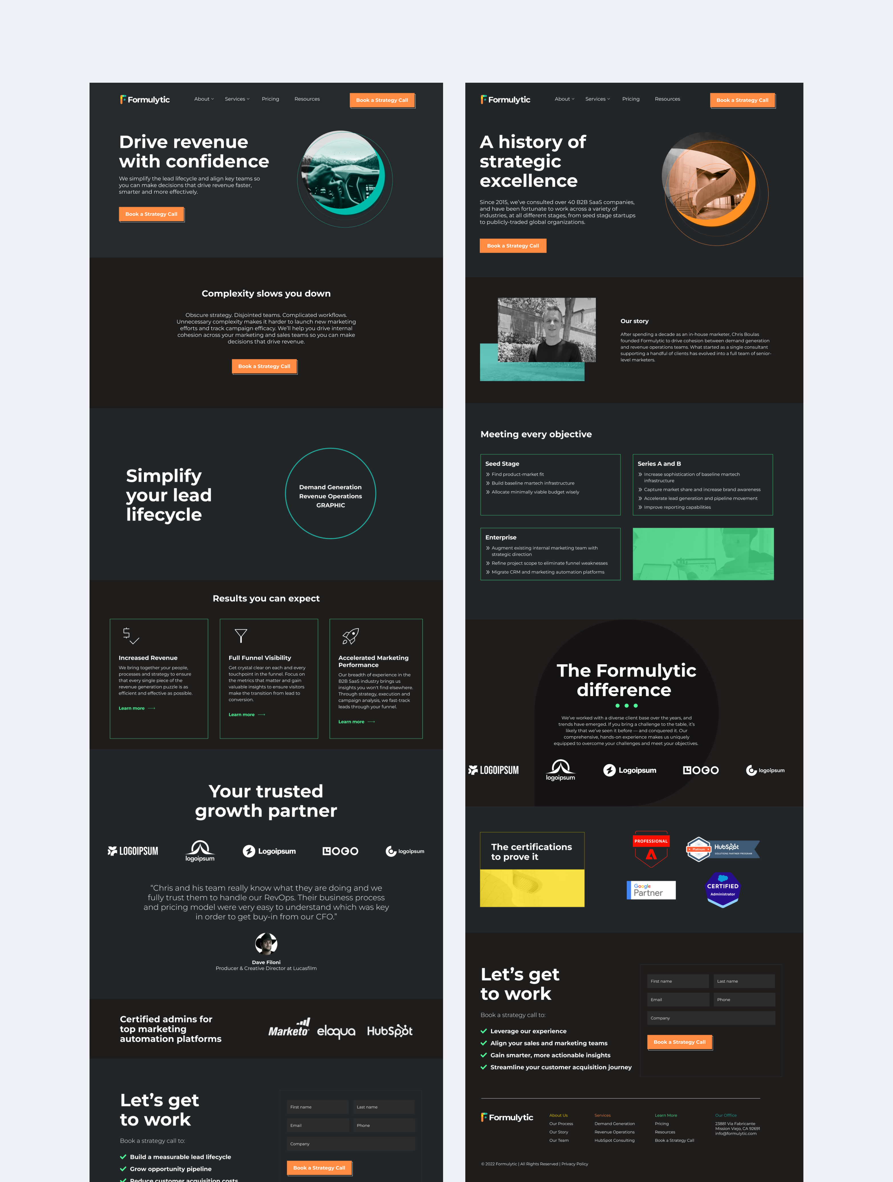
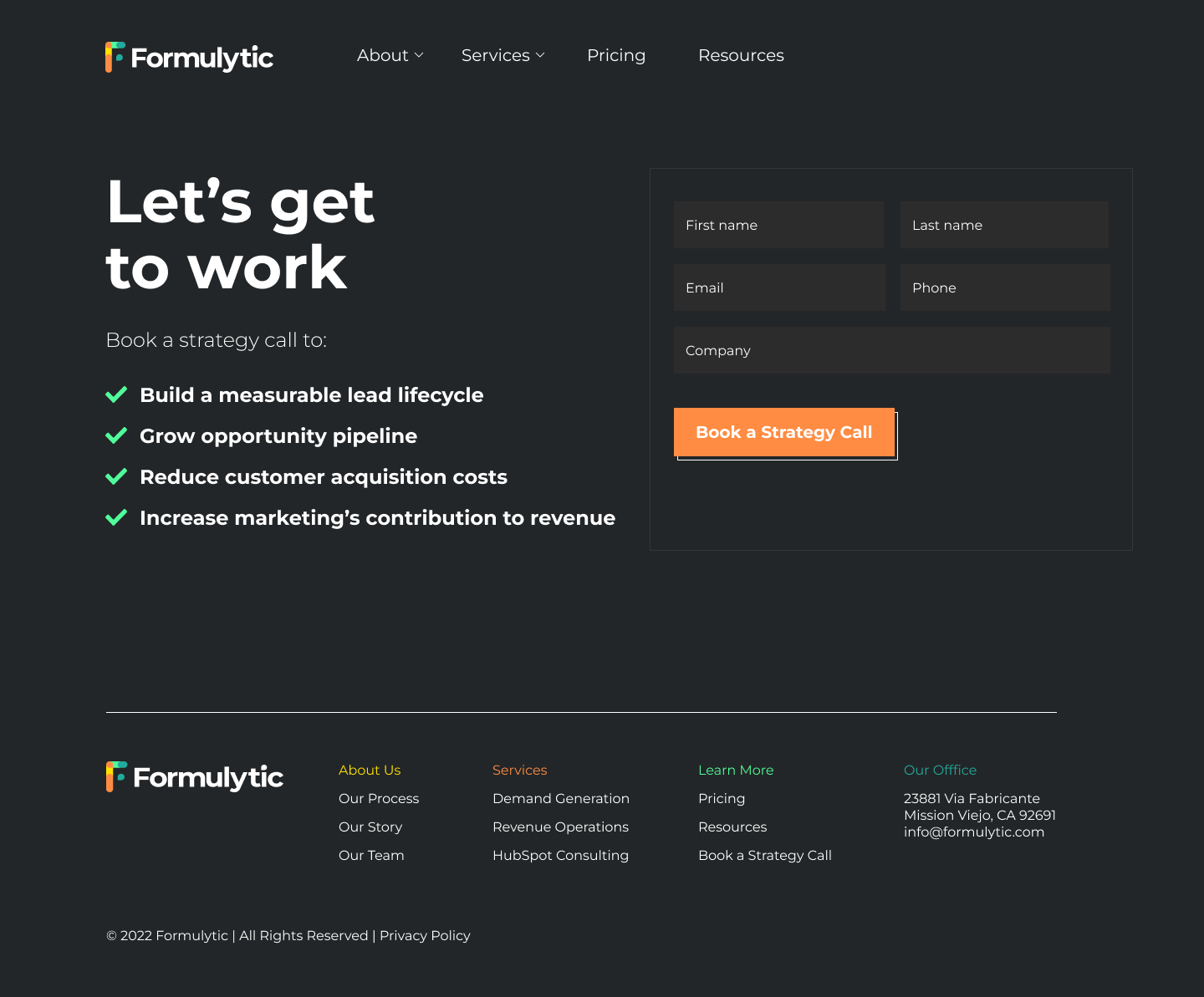
What started as a website refresh turned into an entire rebrand for Formulytic. The process started between the CEO and a copywriter. Once all the copy was written, it was then passed over to me as this web site was planned as a content-first design.
The previous iteration of the brand featured a lot of technical jargon in the content. The rebrand would feature content that would be easily digestible by not only CMOs but CFOs as well. Based on our research, we found that CFOs are often the final decision maker when it comes to large project spending. The brand previously featured a lot of stock vector illustrations on their website. After discussing some of their pain points with the CEO of Formulytic, we decided that we needed to steer clear of that in order to really differentiate the brand from many other revenue operation agencies.
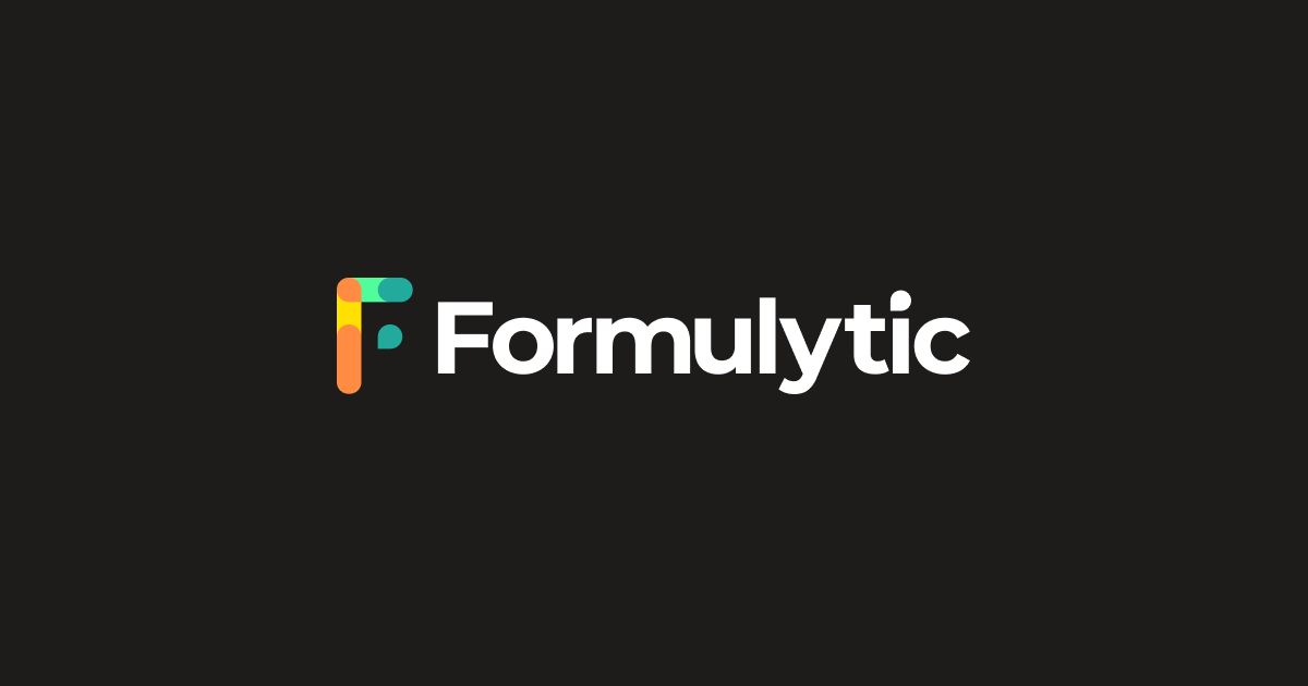
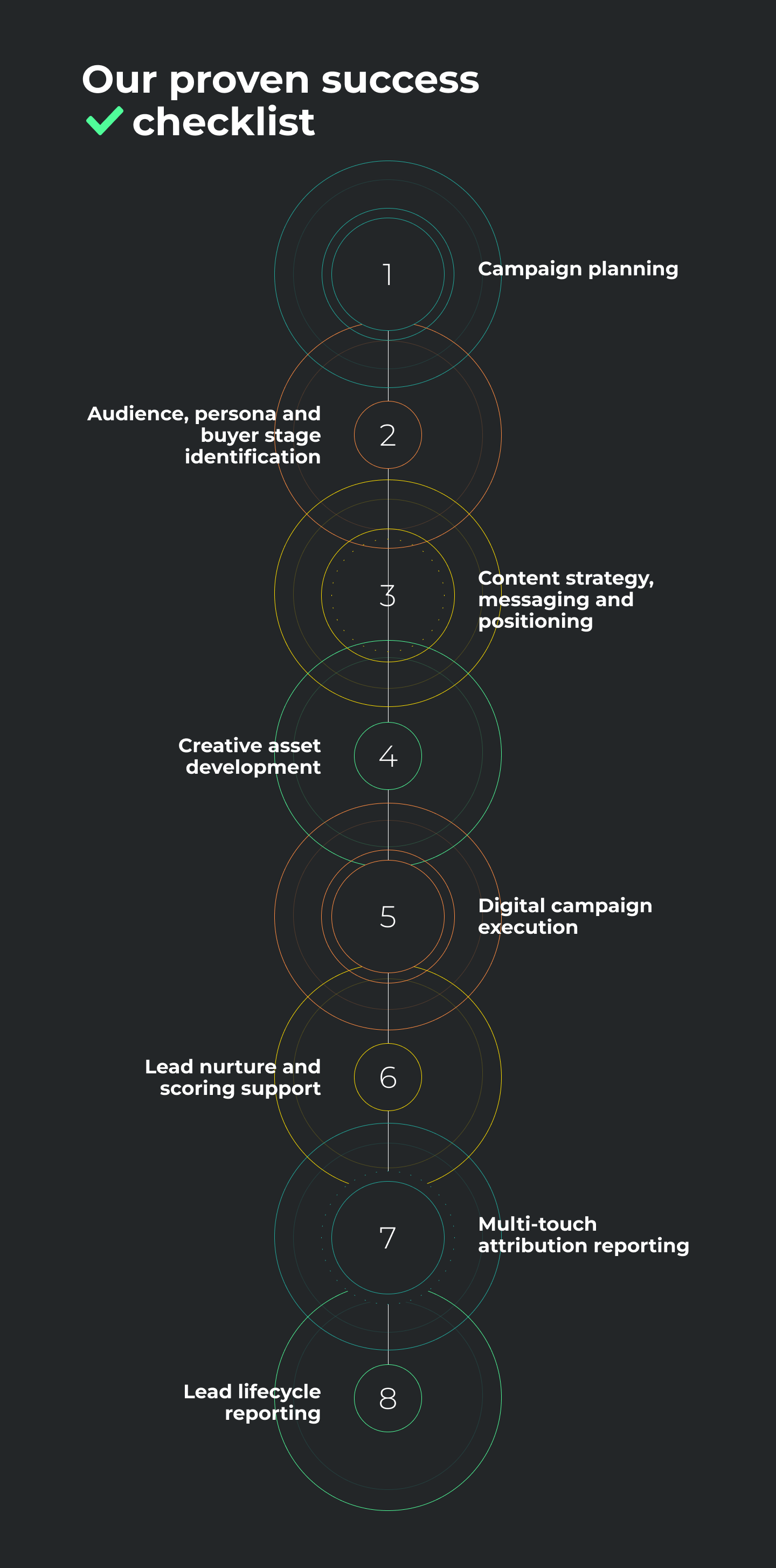
When it came to redesign the logo, the client mentioned that he still wanted to carry over an orange from the previous logo but wanted to venture into a larger color palette. After talking with client over Zoom, I noticed that he had recently redone his home office in order to turn it into an office and studio for recording podcasts and videos. The office featured many mid-century modern elements such as modern warm lighting and a tan colored leather chair. I used these elements as inspiration for the Formulytic logo and color palette. The logo featured a custom sans serif typeface and a logo mark inspired by various mathematical symbols to represent the "formula" in "Formulytic." One the color palette was narrowed down, we opted for a dark theme in order for the brand colors to really stand out. The website features modern photographic and thin line vector illustrations that play on the mid-century modern theme.

