Brand Landing Page
-
ClientPatagonia
-
RoleUI/UX Design, Web Design
-
Overview
This landing page was developed for and in partnership with Patagonia. this was the first time in over five years that Patagonia would return to the website and Moosejaw wanted to make a welcoming impression. A list of directives was given to me that needed to be covered on the page. the copy was supplied by our copywriters. free range of design was given to me with the exceptions that it needed to feature products and navigation buttons right below the hero banner. I then researched Patagonia's site and many competitors sites in the retail space.
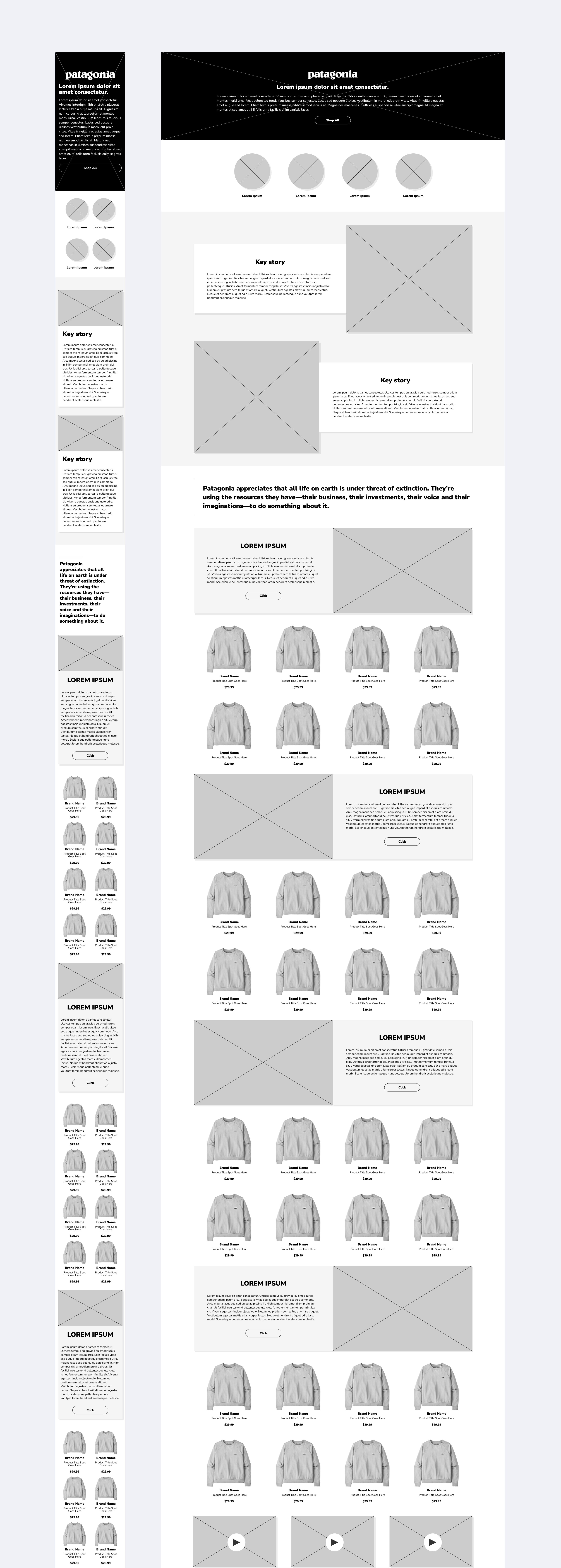
A wireframe was created and approved by both teams. a high fidelity mockup was the n created and approved after a couple iterations, many focusing on copy.
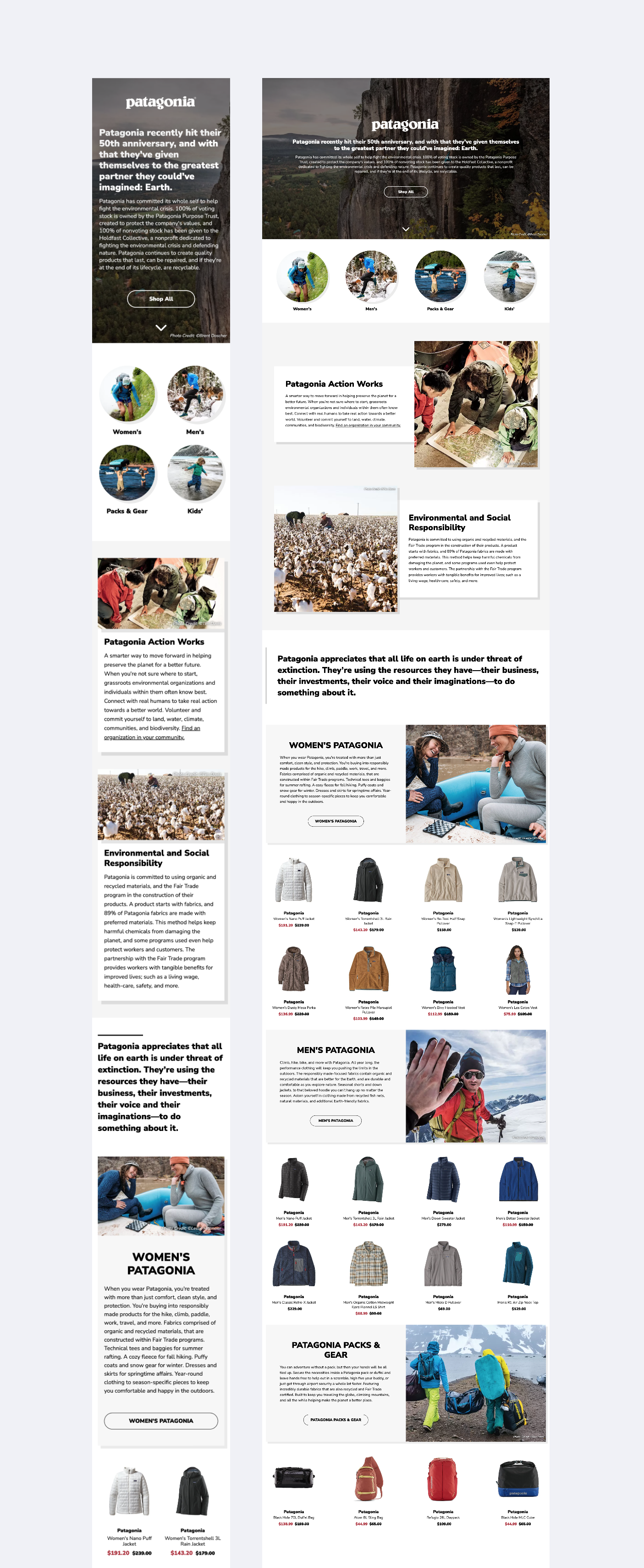
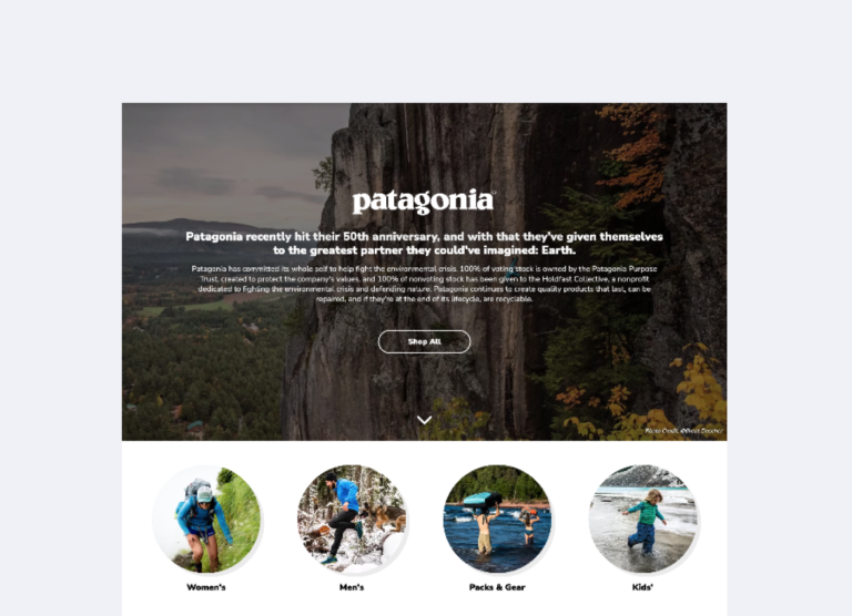
The hero banner takes up the entire viewport which draws the customer's attention to the paragraph copy and incredible background imagery. below that are round navigational images that serve as anchor links to the appropriate sections below. the values messaging helps describe the Patagonia story and brand as a whole. the products featured in each section were added in using personalization software. the algorithms select the most popular Patagonia products for each category respectively. the featured products were developed so that the buying team could manually override the top picks as needed.
"Gold standard for how the brand looks via online with a wholesale partner…really like it.” - Ryan Gellert, CEO of Patagonia, Inc.
